Creating a peaceful atmosphere in your home starts with choosing the right colors. Colors have a powerful impact on our mood and can influence how relaxed or energized we feel in a space. If you’re looking to transform your home into a calming sanctuary, focusing on soothing color palettes is an excellent place to start.
In this guide, we’ll explore practical tips to help you select calm colors for your home, covering everything from color psychology to how to combine shades effectively.
Why Choose Calm Colors for Your Home?
Before diving into specific colors, it’s helpful to understand why calming colors matter. Calm colors tend to promote relaxation, reduce stress, and create a feeling of balance. This is especially important in areas where you unwind, such as bedrooms, living rooms, or reading nooks.
By incorporating these hues thoughtfully, you can:
– Enhance your overall well-being
– Increase comfort and coziness
– Create visually harmonious spaces
Understanding Color Psychology
Color psychology studies how different colors impact our emotions and behavior. While personal preferences vary, some colors are widely recognized for their calming effects:
– Blue: Often associated with tranquility and calmness, blue mimics the sky and ocean. Light blues are especially soothing and can lower feelings of anxiety.
– Green: Symbolizing nature, green promotes balance and refreshment. It’s easy on the eyes and fosters a sense of renewal.
– Lavender and Soft Purples: These shades add a gentle touch of calm with a hint of creativity and spirituality.
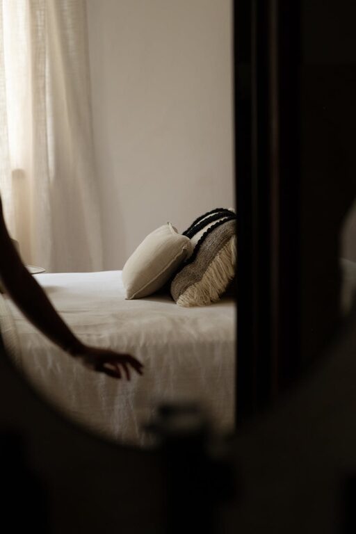
– Neutrals (Beige, Gray, Soft Whites): Neutral shades provide a clean, peaceful backdrop and pair well with most colors without overwhelming the senses.
Tips for Choosing Calm Colors in Your Home
1. Consider the Room’s Purpose
The function of each room should influence your color choice. For example:
– Bedrooms benefit from blues and greens that support restful sleep.
– Living rooms can embrace warm neutrals or muted pastels to create an inviting space for relaxation and conversation.
– Bathrooms often feel spa-like with soft blues, greens, or pale grays.
2. Start with a Neutral Base
A neutral base sets a calm foundation and offers versatility. Using soft whites, light beige, or muted gray as wall colors provides a serene backdrop that won’t overpower your space.
From there, you can add accents or textiles in calming colors to bring warmth and interest.
3. Test Colors with Samples
Colors can look very different depending on lighting. Natural light, artificial lighting, and shadows all affect how a shade appears.
Before committing, paint small sections of your wall or use large sample boards to observe the color throughout the day. This ensures you select hues that maintain their calmness under various lights.
4. Use Soft, Muted Shades
Intense or very bright colors tend to energize, which may work against a calming atmosphere. Opt for muted or pastel versions of calming colors — these softer shades reduce visual stimulation and promote relaxation.
For example, dusty blue instead of bright royal blue, or sage green rather than vibrant kelly green.
5. Create a Cohesive Palette
When choosing your calm colors, think beyond a single hue. Use a palette of 2-4 complementary calming colors for walls, furniture, and decor.
A balanced palette can be both visually appealing and peaceful. For example, pairing light gray walls with soft green cushions and lavender accents creates harmony.
6. Consider Texture and Finish
Color isn’t the only factor in creating calm spaces. Texture and paint finish matter too:
– Matte or eggshell finishes diffuse light softly and avoid glare, helping maintain a calm feeling.
– Soft fabrics like linen or cotton in calming colors add comfort and depth.
– Natural materials like wood or stone work beautifully with calm color schemes by adding warmth and grounding.
7. Balance Color with Lighting
Soft lighting can enhance calming colors. Use warm-toned bulbs, dimmable fixtures, or layered lighting (ambient, task, accent) to create a cozy atmosphere that complements your palette.
Popular Calm Color Combinations
Here are some tried-and-true combinations that consistently create peaceful interiors:
– Soft Blue + Warm Gray
– Sage Green + Creamy White
– Lavender + Taupe
– Pale Aqua + Light Beige
– Light Gray + Muted Blush Pink
Final Thoughts
Choosing calm colors for your home can transform it into a restful haven that promotes well-being and comfort. Remember to consider the room’s purpose, test colors in your lighting, and pair muted tones with cozy textures.
With these tips, you’re well-equipped to select soothing colors that make coming home truly relaxing.
—
Would you like help picking the perfect palette? Try visiting your local paint store or exploring online color visualizers to experiment with calm color options before committing. Happy decorating!